I spent way too much time and effort looking at the CS2 map crests
Of all the nifty new features in Counter-Strike 2, clearly, it’s the map crests that warrant the most discussion and attention as we head into 2024. Here’s the definitive ranking based on my decades of experience of having eyes and getting shot at over and over again in the game.
Nuke
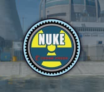
Easily the most recognizable and cleanest crest of them all, courtesy of the prominent radioactivity symbol, though the blue-and-yellow color scheme is an odd departure from the typical yellow-and-black version of these signs. Bonus points for adding Cedar Creek, the fictional plant’s location, to the icon, though we all know it’s really in Harz, Germany, if you’ve been around the block.
Italy
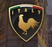
An appealing curved crest shape, the national tricolor neatly tucked below the golden arch on the top, all dominated by a humongous chicken: what’s not to like? We need more CS2 matches played on this map, people.
Dust II

Why the crown? Because it’s the king of all Counter-Strike maps, right? No part of the in-game iconography warrants it otherwise. Gigantic bonus points for making the II-shaped 2 as the double door on mid: a lovely little touch.
Ancient
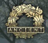
We all know this map is Aztec II deep inside, and the crest with the Quetzalcoatl-like serpent definitely reinforces this vibe, and the way it evokes the ouroboros (the ancient dragon eating its own tail) makes one think of the seemingly endless wait for Source 2, on which the map was clearly designed. The brass color evokes the idea of treasures long gone, like the MMR points you lost over the course of the past few months playing here. It’s neat enough.
Inferno
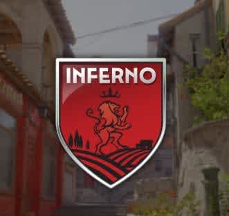
It’s red, I suppose? I can kind of see it, but are a wheat field and a lion the first two things that come to your mind when you think of this iconic Counter-Strike map? The skybox is of a mountainside, after all. Even with its CS2 iteration’s new, colorful look, it just doesn’t really mesh for me. Thankfully, the name is so striking and iconic – both in terms of the text and the font – that it immediately draws attention to itself, relegating the rest to an afterthought. Normally, that would be a bad thing, but since it’s all a rather poor fit, it kind of comes out as a plus? It’s a vibrant meh in my book.
Office
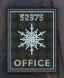
The rectangular shape makes this one stand out by itself, the color scheme perfectly matches the cold winter attire of the map, and adding the iconic building number alongside the map name is also a neat nod. The snowflake as the big-ticket imagery, though? Surely, the vending machines, the projector, or something else indoors would evoke more memories.
Overpass
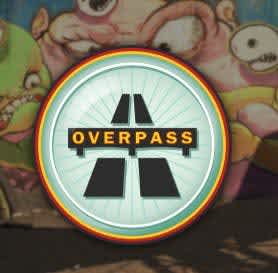
I simultaneously love and hate this one. The imagery is awesome, and the design is clean and concise – it’s great, really. It just has nothing to do with the Counter-Strike map? Neither the dominant white background nor the grey concrete matches the primary color scheme of the map or the skybox, and evoking the highway sign makes little sense for a mid-city overpass, especially when you play as pedestrians.
Mirage
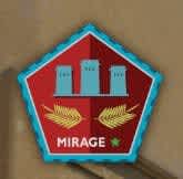
I left this one for last when writing because I simply don’t get this at all. I think it’s the proportions that throw me off, the gigantic wheat heads that grow sideways under the three towers that are now blue for some reason, with a red background, a color that makes little to no appearance on the map itself. It is also the crest with the least-prominently placed map name, with a pitiful generic font and a non-centered positioning. To round it all off, there is a completely random green star next to it that I can’t make sense of for the life of me. Is it like the one Major winners get to emblazon on their uniforms? Is it to signify that it is the only map to have been played in every single CS:GO Major? I… just… I’m baffled.
Anubis

The jackal head is a nice idea, even if the bright blue eyes feel out of place, but this crest nevertheless feels like a poor fit all around. The crest’s sharp and metallic look is a far cry from the map’s architecture, and the hieroglyphs on the bottom are too small to be legible. It has a lot of character but feels as if it belongs to a different map entirely. Also, the centralization of the text is fucking cursed, adding to the uneasy feeling I get whenever I look at this one.
Vertigo
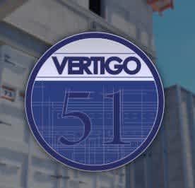
This one is easily the worst crest of the bunch, which is fitting for what’s easily the worst map of the bunch. A simple circle with two colors and a simple texture, with the map name in a generic font in small at the top, with most of the space made up of the massive 51, referring to the number of floors in the skyscraper, something that would easily elude a significant chunk of the player base. If you blurred out the word and the map, would you be able to tell which map this is a crest for? No. It fails as a basic signifier – and we’ve seen with Overpass that you can do so much more with such a simple set of shapes.


